|
Report: Remaining Work
Description
 |
|
Activities using this report
|
How much work is left to be done, and when will it be completed? This cumulative flow diagram shows work remaining measured as scenarios and quality of service requirements being resolved and closed in the iteration.
Healthy Example
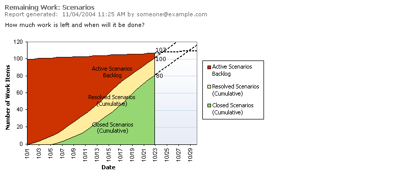
This remaining work report shows a healthy trend to an end of year delivery. Data Series
| Line |
Description |
|
Work Item States |
- Each data series (color band) represents the number of work items that have reached the corresponding state as of the given date. For a more accurate graph, you can use the sums of estimated and actual effort for each of the items, but if your estimates are at consistent granularity, count is easier to compute and just as useful.
|
|
Chart Height |
- The total height is the total amount of work to be done in the iteration. If the top line increases, it means that total work is increasing. Typically, the reason is that unplanned work is adding to the total required. That may be expected, if you have scheduled a buffer for unplanned work, such as bug fixing. (See Unplanned Work below.) If the top line decreases, it means that total work is decreasing, probably because work is being cut out of the iteration.
|
|
Work in Progress |
- Current status is measured by height on a particular date. The remaining backlog is measured by the current height of the leftmost area, Active in this case. The current completions are shown by the current height of the rightmost area, Closed. The height of the band in-between indicates the work in progress, in this case items Resolved but not Closed.
|
|
Resolved |
- Watch for variation in the middle bands. An expansion can reveal a bottleneck, for example, if too many items are waiting to be tested and testing resources are inadequate. Alternatively, a significant narrowing of the band could indicate spare capacity.
|
|
End Date |
- Visually, it is easy to extrapolate an end completion inventory or end date for the backlog from a cumulative flow diagram like this. A small caution applies, however. Many projects observe an S-curve pattern, where progress is steepest in the middle. The common-sense explanations for the slower starting and ending rates are that startup is always a little difficult, and tough problems tend to get handled at the end of a cycle.
|
Unhealthy Examples
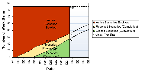
This remaining work report shows that the slope of the Closed line is going to hit the iteration end date well below the planned level, meaning that not all of the scenarios planned for this iteration will be completed before exiting the iteration. This problem may be due to underestimation. When progress falls short of planned progress and effort is greater than estimated, difficulty, time, or other factors are being underestimated. 
This remaining work report shows a bulging line in Resolved, meaning that the developers are reporting work items as Resolved, but testers have not closed them. Further investigation is warranted. |
 |