Report: Actual Quality versus Planned Velocity
Description
 |
|
Activities using this report
|
How many scenarios can be completed before quality is unacceptable? As much as teams believe the saying "haste makes waste" there is usually a business incentive to go faster. A project manager’s goal ought to be to balance the two by finding the maximum rate of progress that does not make quality suffer. This graph presents the relationship, for each iteration, of estimated size to overall quality.
Healthy Example
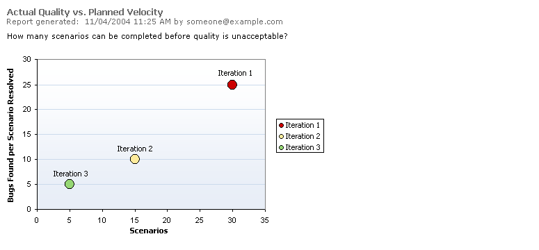
From iteration to iteration, the team is planning fewer scenarios for completion and achieving higher quality per scenario. This is a good clue to the ideal number of scenarios that the team can finish in an iteration.
Data Series
| Line |
Description |
|
Scenarios |
- The x-axis is the number of scenarios actually closed (completed) in the iteration. Each bubble is labeled according to its iteration.
|
|
Bugs Found per Scenarios Resolved |
- The y-axis is the total number of bugs found divided by the scenarios closed. (In other words, the average number of bugs per scenario.)
|
|
Total Estimated Work |
- The area of each bubble is the amount of work estimated in the iteration, computed as the sum of rough order of magnitude estimates on the scenarios.
|
|
Efficiency |
- Stoplight colors go from green for the lowest bugs per iteration to red for the highest. If haste is in fact making waste, larger bubbles (larger iterations) will be higher in the upper right area of the graph and smaller ones lower in the lower left area of the graph. If you are working at a comfortable pace, and have not seen quality drop with planned iteration size, then all iterations will be at roughly the same height on Y.
|